• Skip to primary navigation
  • Skip to content
  • Skip to primary sidebar
  • Home
  • About Us
    • Privacy Policy
    • Comment Policy
    • Disclosures & Disclaimers
  • Resources
    • Links, Essays & Articles
    • Fandomology!
    • CLAMP Directory
    • BlogRoll
  • Features & Columns
    • 3 Things Thursday
    • Adventures in the Key of Shoujo
    • Bit & Blips (game reviews)
    • BL BOOKRACK
    • Bookshelf Briefs
    • Bringing the Drama
    • Comic Conversion
    • Fanservice Friday
    • Going Digital
    • It Came From the Sinosphere
    • License This!
    • Magazine no Mori
    • My Week in Manga
    • OFF THE SHELF
    • Not By Manga Alone
    • PICK OF THE WEEK
    • Subtitles & Sensibility
    • Weekly Shonen Jump Recaps
  • Manga Moveable Feast
    • MMF Full Archive
    • Yun Kouga
    • CLAMP
    • Shojo Beat
    • Osamu Tezuka
    • Sailor Moon
    • Fruits Basket
    • Takehiko Inoue
    • Wild Adapter
    • One Piece
    • After School Nightmare
    • Karakuri Odette
    • Paradise Kiss
    • The Color Trilogy
    • To Terra…
    • Sexy Voice & Robo
  • Browse by Author
    • Sean Gaffney
    • Anna Neatrour
    • Michelle Smith
    • Katherine Dacey
    • MJ
    • Brigid Alverson
    • Travis Anderson
    • Phillip Anthony
    • Derek Bown
    • Jaci Dahlvang
    • Angela Eastman
    • Erica Friedman
    • Sara K.
    • Megan Purdy
    • Emily Snodgrass
    • Nancy Thistlethwaite
    • Eva Volin
    • David Welsh
  • MB Blogs
    • A Case Suitable For Treatment
    • Experiments in Manga
    • MangaBlog
    • The Manga Critic
    • Manga Report
    • Soliloquy in Blue
    • Manga Curmudgeon (archive)

Manga Bookshelf

Discussion, Resources, Roundtables, & Reviews

Marvel Comics

Star Wars: Episode I – The Phantom Menace

January 5, 2020 by Katherine Dacey

As The Rise of Skywalker brings the Star Wars saga to its official close, now seems like the right time to revisit the very first chapter in the series, The Phantom Menace. Episode I debuted in 1999, making the leap from screen to print the following year with Kia Asamiya providing the illustrations. Readers familiar with Asamiya’s Silent Möbius will immediately understand why he was tapped for this project: he has a penchant for drawing detailed space ships and cityscapes, two important qualifications for translating George Lucas’ vision into a compelling comic.

Alas, Asamiya was also saddled with Lucas’ original script, leaving him little room to make the story more interesting on the page than it was on the screen. Asamiya faithfully preserves the film’s most frustrating elements—the tin-eared dialogue, the unfortunate minstrelsy of JarJar Binks—as well as its surfeit of plot points, secondary characters, and clumsy discussions of Federation trade policy. To his credit, Asamiya’s version is brisk and streamlined in contrast with Lucas’, marching from one scene to the next with a sense of urgency that’s often lacking from the film. Some of the film’s most tedious scenes—the blockade of Naboo, the first interactions between Padme and Anakin, the Imperial Senate’s deliberations—have been telescoped, giving Asamiya room for more detailed treatments of chases, light saber fights, and space battles.

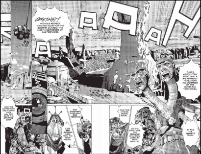
The artwork, on the other hand, is a hit-or-miss affair. Asamiya’s skill at drawing aliens, robots, space craft, and futuristic cities is unquestionable; his evocation of Otoh Gunga and Coruscant do justice to the complexity and specificity of Lucas’ original designs, while Asamiya’s establishing shots of Naboo convincingly evoke the planet’s lush jungles and Greco-Roman palaces without the added benefit of color. His ability to compress lengthy action sequences is likewise impressive; in just a few artfully constructed pages, for example, he captures the excitement and danger of Anakin Skywalker’s pod race, using panels-within-panels to juxtapose the racers’ progress with the crowd’s ecstatic reaction to the event:

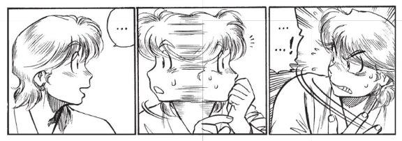
Asamiya’s human characters, by contrast, are as expressionless as their big-screen counterparts—a key failing, as the characters register as pawns, not people, dutifully shuttled from one scenario to the next with almost no sense of how the violence and chaos they’ve encountered has affected them. Only the two principle non-human characters—JarJar Binks and C3PO—are drawn in an animated fashion, providing the series’ few moments of genuine emotion and surprise.

And that, in a nutshell, is why Asamiya’s take on The Phantom Menace is so frustrating: it improves on certain aspects of the source material while emphasizing its fatal flaws, making for an efficient but affectless gloss on Lucas’ original story that reads a lot like Cliff Notes. Not recommended.

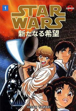
STAR WARS: EPISODE I – THE PHANTOM MENACE, VOLS. 1-2 • ART BY KIA ASAMIYA • MARVEL COMICS • NO RATING (SUITABLE FOR READERS 10 AND UP)

Filed Under: Manga, Manga Critic, REVIEWS Tagged With: Kia Asamiya, Marvel Comics, Sci-Fi, star wars

The Best Manga You’re Not Reading: Star Wars

December 29, 2017 by Katherine Dacey

I was five years old when Star Wars: A New Hope blasted its way into movie theaters. Like most members of Generation X, the film cast a long shadow over my childhood, dictating my Halloween costumes, afterschool play, Happy Meal purchases, toy collections, and clothing; I had Princess Leia action figures, Star Wars drinking glasses, Star Wars t-shirts, and a Star Wars beach towel. One of the few tie-in products I didn’t own, however, was a comic book adaptation of the movie. I’d purchased The Star Wars Storybook at a Scholastic book fair in 1978, but never knew that Marvel Comics or manga publishers were peddling something similar.

That’s a pity, because Star Wars has a long and fascinating history in print. Marvel’s six-issue adaptation of A New Hope, for example, was cooked up by a Lucasfilm executive to drum up business for the film — in essence, it was a trailer for comic geeks, arriving on newsstands a month before the movie opened. Though Marvel executives had been reluctant to license Star Wars — according to former editor Jim Shooter the “Prevailing Wisdom” at Marvel was that “science fiction doesn’t sell”  — it proved one of the company’s best business decisions of the 1970s. “The first two issues of our six issue adaptation came out in advance of the movie,” Shooter observed:

Driven by the advance marketing for the movie, sales were very good. Then about the time the third issue shipped, the movie was released. Sales made the jump to hyperspace. Star Wars the movie stayed in theaters forever, it seemed. Not since the Beatles had I seen a cultural phenomenon of such power. The comics sold and sold and sold. We reprinted the adaptation in every possible format. They all sold and sold and sold.

By contemporary standards, Roy Thomas and Howard Chaykin’s version is skillful but a little stodgy, relying on voice-overs to introduce key characters and explain plot points, rather than allowing the art to shoulder the responsibility of telling the story. Nonetheless, as Star Wars fever crossed the Pacific, Weekly Shonen Magazine republished Thomas and Chaykin’s comic, touching off a Star Wars manga blitz in Japan.

Japan caught Star Wars fever again in 1997, when the Special Edition trilogy hit theaters across the globe. Kadokowa’s MediaWorks division churned out a new set of Star Wars manga, hiring Hisao Tamaki (A New Hope), Toshiki Kudo (The Empire Strikes Back), and Shin-Ichi Hiromoto (Return of the Jedi) to handle the adaptations. And while all three are good, faithfully reproducing the main beats from each film, Tamaki’s version of A New Hope is that rarest of tie-in products: it captures the look and feel of the movie without slavishly copying it, offering both a fresh perspective on a canonical text and a point of entry for someone wholly unfamiliar with Star Wars. 

Part of what makes Tamaki’s version so fascinating is how he compensates for the absence of a soundtrack — no mean feat, given how noisy the Star Wars universe is. While Tamaki uses plenty of hand-lettered sound effects, he never uses them as a crutch, instead finding nifty ways to help us imagine the sound of a landspeeder skimming the desert floor or a Stormtrooper firing his blaster. Tamaki’s most effective tactic is careful attention to the velocity and direction of moving objects; through deft placement of speedlines and artful manipulation of the panels’ shape and size, he conveys the same information that a well engineered roar, squeak, thud, or electronic rumble might.

Then there’s the film’s lush, Wagnerian score, the kind of movie music that had been fashionable in the era of Ben Hur and Lawrence of Arabia but was considered unhip in the gritty, naturalistic world of early 70s cinema. The opening fanfare and dense web of leitmotifs are unquestionably part of A New Hope‘s appeal, goosing fight scenes and capturing the melancholy of a young Luke Skywalker as he gazes at a Tatooine sunset. Absent those musical prompts, however, Tamaki is forced to think about how to elicit the same emotions in words and pictures. One of the most dramatically successful attempts to bridge sound and silence occurs in volume one of Tamaki’s adaptation, right after R2D2 and C3PO land on Tatooine:

In the film, John Williams accompanies C3PO’s trek with music cribbed from The Rite of Spring — a decent choice, as Stravinsky’s dour ostinati and octatonic harmonies imbue the harsh landscape with an otherworldly quality. Tamaki, however, distills this two-minute scene to an evocative two-page spread in which a wide-angle view of the Tatooine desert unfolds beneath the individual panels, reminding us just how small and vulnerable both droids are. These images track closely with Lucas’ own vision, but the implied silence of the first and final panels in this sequence more powerfully conveys C3PO’s isolation than any musical gesture could:

The absence of sound has another unexpected benefit: minus the actors’ desperate attempts to make George Lucas’ dialogue sound… well, like conversation, the script has more room to breathe. Tamaki plays the earnest stuff straight and ramps up the comedy whenever someone is surprised or indignant. Luke, in particular, benefits from such an approach, given his age and naivete; in Tamaki’s hands, he’s Monkey D. Luffy with a lightsaber, freaking out over chores, the Millennium Falcon’s shabby appearance, Obi-Wan Kenobi’s death, a kiss from Princess Leia… you get the idea. Tamaki’s elastic deformations of Luke’s face transform him from blandly handsome farm boy to Shonen Jump hero, equal parts brave and ridiculous:

One of the manga’s other great virtues is its ability to expand and contract time in ways that a purely temporal medium like film can’t. The ability to speed up and slow down the unfolding the plot isn’t unique to comics, of course; filmmakers can use slow motion imagery or cross-cutting to manipulate the viewer’s perception of time, but a good manga artist takes advantage of the fact the reader can, in fact, stop time by poring over an image or a scene for minutes, savoring small but telling details that would otherwise get lost in the cinematic flow. Writing for Animerica in 2004, Patrick Macias offered a thoughtful explanation of how this kind of creative expansion of time adds new layers of meaning to Tamaki’s story:

It is in Tamaki’s take on destruction of the planet Alderaan that he really shows off his stuff. A scene that took mere moments to depict on-screen is drawn out to fill half a dozen pages. He inserts images of the Alderaan populace looking up to the heavens, and you can almost hear those “millions of voices suddenly crying out in terror” with more dramatic impact in the manga than in the film.

Of course, none of this would matter if Tamaki lacked the precision to bring Lucas’ vision to life on page. Again and again, Tamaki delivers amazingly detailed drawings of space ships, aliens, and weapons that pulse with the same life as Katsuhiro Otomo’s AKIRA and Shirow Masamune’s Ghost in the Shell; if you’d never seen or heard of Star Wars, you might reasonably infer that Tamaki dreamt up this world on his own. Tamaki proves equally adept at staging deep space dogfights, too, conveying both the dizzying speed with which the ships are moving and the maze-like surface of the Death Star:


For readers coming to the manga from the films, the biggest stumbling block will be the character designs: did Tamaki get them right? The short answer is yes, if you can tolerate a little artistic license with hairdos and body types. Not surprisingly, R2D2 and C3PO look most like their big-screen counterparts — no pesky noses or mouths to draw — but the rest of the cast bear a passing-to-strong resemblance to the actors who portrayed them, though Obi-Wan Kenobi looks and moves more like Chuck Norris than Sir Alec Guiness. Tamaki does an even better job of bringing Darth Vader and his Stormtroopers to life on the page, adding an extra touch of menace in the way he draws their helmets; you can almost see the soldiers grimacing under their plastic armor from the way he draws their browlines.

If I’ve sold you on manga Star Wars, you’ll be happy to know it’s a relatively inexpensive way to relive the original trilogy. The digital versions — currently available through Amazon and ComiXology — retail for $1.99 per volume. There’s also a Phantom Menace manga for the morbidly curious; Kia Asamiya is the author, and he’s been given the truly thankless task of condensing that stinker into two volumes. At least it won’t be as interminable as the movie.

WORKS CONSULTED

Macias, Patrick. “Star Wars, The Manga.” Animerica, VIZ LLC, 7 Apr. 2004, https://web.archive.org/web/20040407180902/http://www.animerica-mag.com/features/starwars.html. Accessed 27 Dec. 2017.

Rickard, Ron. “Retro Foreign: Japanese Weekly Shōnen Magazine #18 – 23 (1978).” Star Wars Comic Collector, 20 May 2016, http://swcomiccollector.blogspot.com/2016/05/retro-foreign-japanese-weekly-shonen.html. Accessed 27 Dec. 2017.

Shooter, Jim. “Roy Thomas Saved Marvel.” Jim Shooter, 5 July 2011, https://web.archive.org/web/20150912134444/http://www.jimshooter.com/2011/07/roy-thomas-saved-marvel.html. Accessed on 28 Dec. 2017.

Spellman, Ron. “A Long Time Ago: The Strange History of Marvel’s Original Star Wars Universe.” Comics Alliance, Townsquare Media, 28 Jan. 2016, http://comicsalliance.com/original-marvel-star-wars-comics-history/. Accessed 28 Dec. 2017.

Tamaki, Hisao. Star Wars: A New Hope, adapted from an original script by George Lucas, Marvel Comics, 1998. 4 vols.

Filed Under: Manga, Manga Critic, Recommended Reading, REVIEWS Tagged With: Dark Horse, Hisao Tamaki, Kadokawa, Marvel Comics, star wars

An Open Letter to Movie Critics

May 25, 2012 by Katherine Dacey 19 Comments

By now, if you’re a movie critic, you’ve filed your Avengers — sorry, Marvel’s The Avengers — review and are girding your loins for The Amazing Spider-Man and The Dark Knight Rises. Before you hold forth on the evils of comic book movies, or write an essay about superhero decadence, let me offer a few suggestions for reviewing Spider-Man and The Dark Knight. These tips won’t guarantee that every DC or Marvel man will be wowed by your references to Rio Bravo and Yojimbo, or swayed by your measured criticisms, but they will ensure that movie-goers like me — smart folk who like Lawrence of Arabia and The Walking Dead — won’t roll our eyes in disgust at yet another review that begins, “Hollywood must be out of ideas, because they sure do like to make comic book movies.”

1. Don’t trot out the “superheroes are for kids” line.

Neither DC Comics nor Marvel have been publishing superhero comics for kids since the mid-1980s. OK — that’s not entirely true. In the interest of reaching out to younger readers, both companies have created all-ages versions of Batman, Spider-Man, and other popular stories. That both companies felt the need to create kid-friendly versions of these properties ought to tell you something about the content of most DC and Marvel products. Just compare an issue of any New 52 title with Tiny Titans if you don’t believe me; the difference in tone, presentation, and content will astonish you:

This DC Comic is for kids.

This DC Comic is not.

It’s fair to criticize the plot of a comic book movie as being too obvious or simplistic to sustain an adult’s interest, of course, but that’s not the same thing as dismissing the entire enterprise as “kids’ stuff” because ten-year-old boys used to be Stan Lee’s target audience. Comics have evolved. So should your critique of movies based on comics.

2. Get your facts straight.

Take it from a comic book reviewer: if you whiff a detail — no matter how insignificant — fans will stop following your argument and start building a case against you. Amy Nicholson — who wrote a smart, informed review of The Avengers — was eviscerated by fans who fumed that she’d referred to Samuel L. Jackson’s character as “Nick Frost” instead of “Nick Fury.” (The error has since been corrected.)

As someone who reviews Japanese comics in translation, I have deep sympathy for this reviewer. I’ve made similar mistakes, and have endured withering comments from readers who think it a cardinal sin to credit the wrong publisher for a book, or misspell a secondary character’s name. What I’ve learned from that experience is that you might demonstrate your erudition in ten other ways — through the quality of your insights, the depth of your cinematic knowledge, or the creativity of your language — but comics fans won’t give a damn about your opinion if you call Captain America “Stephen Rodgers.”

3. Do your homework.

The best comic-book films work equally well for devoted fans and newcomers alike: think Ghost World (2001), Spider-Man (2002), or Superman (1978), all of which had something to offer both groups of viewers. And while it’s beneficial to share your impression of a comic book movie as a member of the general public — as someone who knows Batman from the campy Adam West show, for example, or from watching Saturday morning cartoons — your review will be more authoritative if you take the time to learn a little more about the characters’ histories. Think about it this way: you wouldn’t review a big-screen adaptation of Sense and Sensibility without reading the novel or watching other versions, so why would you walk into a movie version of a long-running comic book franchise without at least familiarizing yourself with the characters? Read Wikipedia. Visit your local comic book store and talk to the sales clerks. Buy a few trades. It won’t kill you, I promise.

4. Remember that there are many comic book fans who will appreciate a thoughtful review.

We aren’t all rampaging monsters with a taste for critics’ flesh; many of us like an elegant turn of phrase or appreciate a Truffaut reference as much as you do. Don’t insult us for liking comic books, and we won’t sneer at you for suggesting The Avengers was overly long. Scout’s honor.

Filed Under: Manga Critic Tagged With: Comic Book Movies, DC Comics, Marvel Comics, Marvel's The Avengers, The Amazing Spider-Man, The Dark Knight Rises

An Open Letter to Movie Critics

May 25, 2012 by Katherine Dacey

By now, if you’re a movie critic, you’ve filed your Avengers — sorry, Marvel’s The Avengers — review and are girding your loins for The Amazing Spider-Man and The Dark Knight Rises. Before you hold forth on the evils of comic book movies, or write an essay about superhero decadence, let me offer a few suggestions for reviewing Spider-Man and The Dark Knight. These tips won’t guarantee that every DC or Marvel man will be wowed by your references to Rio Bravo and Yojimbo, or swayed by your measured criticisms, but they will ensure that movie-goers like me — smart folk who like Lawrence of Arabia and The Walking Dead — won’t roll our eyes in disgust at yet another review that begins, “Hollywood must be out of ideas, because they sure do like to make comic book movies.”

1. Don’t trot out the “superheroes are for kids” line.

Neither DC Comics nor Marvel have been publishing superhero comics for kids since the mid-1980s. OK — that’s not entirely true. In the interest of reaching out to younger readers, both companies have created all-ages versions of Batman, Spider-Man, and other popular stories. That both companies felt the need to create kid-friendly versions of these properties ought to tell you something about the content of most DC and Marvel products. Just compare an issue of any New 52 title with Tiny Titans if you don’t believe me; the difference in tone, presentation, and content will astonish you:

This DC Comic is for kids.

This DC Comic is not.

It’s fair to criticize the plot of a comic book movie as being too obvious or simplistic to sustain an adult’s interest, of course, but that’s not the same thing as dismissing the entire enterprise as “kids’ stuff” because ten-year-old boys used to be Stan Lee’s target audience. Comics have evolved. So should your critique of movies based on comics.

2. Get your facts straight.

Take it from a comic book reviewer: if you whiff a detail — no matter how insignificant — fans will stop following your argument and start building a case against you. Amy Nicholson — who wrote a smart, informed review of The Avengers — was eviscerated by fans who fumed that she’d referred to Samuel L. Jackson’s character as “Nick Frost” instead of “Nick Fury.” (The error has since been corrected.)

As someone who reviews Japanese comics in translation, I have deep sympathy for this reviewer. I’ve made similar mistakes, and have endured withering comments from readers who think it a cardinal sin to credit the wrong publisher for a book, or misspell a secondary character’s name. What I’ve learned from that experience is that you might demonstrate your erudition in ten other ways — through the quality of your insights, the depth of your cinematic knowledge, or the creativity of your language — but comics fans won’t give a damn about your opinion if you call Captain America “Stephen Rodgers.”

3. Do your homework.

The best comic-book films work equally well for devoted fans and newcomers alike: think Ghost World (2001), Spider-Man (2002), or Superman (1978), all of which had something to offer both groups of viewers. And while it’s beneficial to share your impression of a comic book movie as a member of the general public — as someone who knows Batman from the campy Adam West show, for example, or from watching Saturday morning cartoons — your review will be more authoritative if you take the time to learn a little more about the characters’ histories. Think about it this way: you wouldn’t review a big-screen adaptation of Sense and Sensibility without reading the novel or watching other versions, so why would you walk into a movie version of a long-running comic book franchise without at least familiarizing yourself with the characters? Read Wikipedia. Visit your local comic book store and talk to the sales clerks. Buy a few trades. It won’t kill you, I promise.

4. Remember that there are many comic book fans who will appreciate a thoughtful review.

We aren’t all rampaging monsters with a taste for critics’ flesh; many of us like an elegant turn of phrase or appreciate a Truffaut reference as much as you do. Don’t insult us for liking comic books, and we won’t sneer at you for suggesting The Avengers was overly long. Scout’s honor.

Filed Under: Comics, Manga Critic Tagged With: Comic Book Movies, DC Comics, Marvel Comics, Marvel's The Avengers, The Amazing Spider-Man, The Dark Knight Rises

Comic Conversion: The Wonderful Wizard of Oz

April 7, 2012 by Angela Eastman 10 Comments

The Wonderful Wizard of Oz| Novel: L. Frank Baum / W. W. Norton Norton & Company | Graphic Novel: Eric Shanower and Skottie Young / Marvel Comics

When Dorothy’s dog, Toto, hides under a bed during a twister, she follows in an attempt to save him. As a result, both are trapped in the house as it’s carried away by the storm. Dorothy wakes up to find herself in a new land, and discovers that she has just killed a Wicked Witch. She’s a hero to the Munchkins, but Dorothy only wants to go home—and the only person who can help her do that is the Wizard of Oz. As she travels to see the wizard she meets a talking scarecrow, a man made of tin, and a lion who’s afraid of everything, but when they reach the end of the road will they all be able to get what they wish for?

L. Frank Baum published the first Oz book in 1900, and it became a success almost immediately. He went on to write 13 more novels in the series, and even produced a stage adaptation of the original book. And we all know that Oz has inspired movies, including one written and directed by Baum and, even more famously, the MGM movie starring Judy Garland.

It’s safe to say that The Wonderful Wizard of Oz is universally recognized as a classic novel and a staple of American culture, but Baum’s great aspiration was simply to create an enjoyable story for children: “The Wonderful Wizard of Oz … aspires to being a modernized fairy tale, in which the wonderment and joy are retained and the heart-aches and nightmares are left out.” And that’s just what Baum created. With simple—but still lovely—language, Baum has carried generations of children through his rich, fantastical world full of characters that are entertaining as well as deep and real.

Baum’s story is pretty straightforward, but Dorothy and her friends experience a number of adventures both before and after they meet the Wizard (certainly many more than in the MGM film). Shanower and Young manage to find a way to fit all the adventures from Baum’s novel into the comic—but that’s not necessarily a good thing. Dorothy’s three friends are given more room to expand as characters in the side adventures, but in context of the comic, these feel like wasted time. Bits like the Lion jumping a gorge feel unnecessary, taking up little enough time to seem unimportant, but enough page space to disrupt the flow.

The comic also fails to escape the problem of using too much of the book’s original narration. Much of it is helpful for establishing the setting, but sometimes the narrative is contradictory to the illustrations, such as when Dorothy and the Scarecrow are described as walking through a “dismal country” while the art shows a bright, friendly-looking forest. Luckily the comic doesn’t rely as heavily on the narration as other, less well-crafted adaptations, such as when we first see Dorothy’s home in Kansas. Baum aptly describes the monotony of the scenery in the original novel: “Dorothy … could see nothing but the great gray prairie on every side … The sun had baked the plowed land into a gray mass … Even the grass was not green, for the sun had burned the tops of the long blades until they were the same gray color …” As imagistic as that prose is, Shanower wisely chooses not to put any of the description in his novel. Instead, Young and colorist Jean-Francois Beaulieu give us a sweeping view of the gray plains with Dorothy in her pink dress as the only spot of color.

The art works in favor of the characters as well. Adding his own touches, like a mustache on the Tin Woodman, Young inserts his own vision into the designs rather than simply copying Denslow’s original art or redrawing the actors from the movie. The personality Baum gave his characters shines through, like his roly-poly lion and his viciously cruel Wicked Witch. Young’s illustrations also increase the intensity in some scenes, such as one in which the Scarecrow and Tin Woodman fend off the Wicked Witch’s beasts. Wolves are given bright red eyes, and we see the sketchy shadows of their heads flying as the Woodman chops them apart. A silhouette of the Scarecrow snatches descending crows and crushes their necks.

It seems almost impossible to escape the over-narration problem with comic adaptations, at least those of classic novels, but Shanower manages to reduce it enough so that you’re not constantly wincing at artwork clogged with text. Shanower may have also kept a few too many of the off-shooting scenes, but he does offer those with no Oz experience outside the MGM movie a glimpse of the true depths of Baum’s characters. Young’s art is what really makes this adaptation worthwhile. His illustrations enhance the whimsical fairy tale feel of the original book, giving the comic its own life and a leg to stand on amongst the many adaptations Baum’s work inspired. Baum’s book is a classic that all fans of children’s literature should read at some point (I’m ashamed to say I didn’t read it until adulthood), but Shanower and Young’s adaptation is still a fine means for jumping into the world of Oz.

Have any graphic novel adaptations you think do a good job? Or a comic you want me to check out for you? Leave suggestions for future columns in the comments!

Filed Under: Comic Conversion Tagged With: Eric Shanower, L. Frank Baum, Marvel Comics, Skottie Young, The Wonderful Wizard of Oz

Comic Conversion: Pride and Prejudice

February 9, 2012 by Angela Eastman 2 Comments

Pride and Prejudice | Novel: Jane Austen / Norton Critical Editions | Graphic Novel: Nancy Butler and Hugo Petrus / Marvel Comics

Elizabeth Bennet is happy to see her older sister Jane falling in love with Mr. Bingley, a rich young man who has just taken up residence in a nearby home. Unfortunately, in order to see Bingley, Elizabeth and the rest of the Bennets have to put up with his proud, unsociable friend, Mr. Darcy. After being scorned by him, Elizabeth vows to have nothing to do with the man, and decidedly hates him after finding out about the injustice he’s done to another new acquaintance, Mr. Wickham. But first impressions aren’t always what they seem, and Elizabeth may find that she’s sided with the wrong man.

Pride and Prejudice was originally published in 1813, but despite the nearly 200-year gap between its creation and the present day, Jane Austen’s novel proves itself endlessly popular. There is a plethora of unofficial sequels, as well as several movies and a wonderful mini-series from the BBC. The Victorian novel has even been famously readapted to include zombies in the Bennet sisters’ quest for love. So, despite the distinct lack of action or anything else people expect in a comic, it’s entirely unsurprising that someone tried to make a graphic novel out of Austen’s book.

I won’t hide the fact that, as far as classic novels go, Pride and Prejudice is one of my favorites. Anguished high school students may disagree, but one of the biggest draws of Austen’s novel is the humor. We start right off on a sarcastic note with one of the most famous lines in literature: “It is a truth universally acknowledged, that a single man in possession of a good fortune must be in want of a wife.” Austen spends much of her novel poking fun at society, using characters like Mrs. Bennet (who is basically a caricature) to overemphasize the ideas and expectations of the time, and even by today’s standards her jabs still ring true. But best of all is, of course, the love story: no “love at first sight” garbage, but a gradual shift from hate to affection as misunderstandings and first impressions are slowly overcome.

This may have come from my own warm feelings towards the Elizabeth/Darcy romance, but I had hopes of the graphic novel having a sort of shoujo-manga feel, much like Marvel’s more girl-centered Spider-man Loves Mary Jane comics. The cover in particular tricked me into believing that this would be the case, with its pastel colors and soft shading, along with the cute teen magazine-esque blurbs. The interior art is a different story. The first shot of the Bennet sisters has all five looking awfully sexy and sultry, including Mary, the one often described as plain. Lydia specifically is wearing a heavy-lipped, open-mouthed expression as she talks of the officers in Meryton, as if the artist wants to foreshadow her less-than-desirable behavior still to come. Mrs. Bennet’s large, exaggerated expressions still convey her silliness, and snobby Caroline Bingley wears a suitable pinched expression, but in general the art sucks out much of the lighthearted feeling.

The graphic novel falls victim to over-narration, showing a usual lack of faith in the art to clue readers in to what’s going on. However, there are some cases where the artist shows some sense of how to use a panel layout. When Mr. Collins is proposing to Elizabeth, each row of panels is split between Mr. Collins’ and Elizabeth’s faces; while Mr. Collins is haranguing her, we see on Elizabeth’s face her mounting frustration and annoyance, where in the book we only get her emotions after the speech. We see this similarly again when Mr. Darcy gives his proposal, and her trembling fists show her rage at his pride. But while the graphic novel draws out these scenes, overall the pacing is much too quick. Most of the scenes don’t last beyond a page, if they even get too far, and a lot of very key moments that should have been dwelt on are rushed through.

The characters suffer from the fast pace as well. Many of the main characters escape relatively unscathed—we have a good understanding of Elizabeth’s headstrong personality, and Mrs. Bennet is still satisfyingly absurd. Minor characters do suffer from diminished page time or complete omission: Mary, the middle Bennet sister, only appears on a couple of pages, and Maria and Mrs. Hurst, sisters of other key characters, have been cut out entirely. It’s not big loss, as none of these characters do much to push the plot forward, with Mary only proving an opposite to the rambunctious Lydia and Kitty, and Mrs. Hurst simply echoing Caroline Bingley’s disdain for the Bennets. Unfortunately the downsides of this are greater. We hardly catch sight of Mr. Darcy’s younger sister Georgiana, who doesn’t have a line of dialogue. Even more detrimental to understanding the plot is Mr. Wickham’s diminished page time: his brisk introduction gives us no real clue as to why everyone finds him so initially charming, so the revelation of his past and future immoral behavior isn’t as shocking as in the novel.

Despite the fact that the artist uses some panels to good effect, the two most appealing aspects of Pride and Prejudice—the romance, and the humor—are severely diminished, thanks to a pace that moves too fast and art that just doesn’t match the tone. Marvel’s adaptation is not awful, but it still won’t be appealing to anyone who isn’t already an Austen fan. Even big Pride and Prejudice fans would likely rather chuckle along with Pride and Prejudice and Zombies or spend six hours watching the mini-series than spend the 45 minutes it takes to read this adaptation.

Have any graphic novel adaptations you think do a good job? Or a comic you want me to check out for you? Leave suggestions for future columns in the comments!

Filed Under: Comic Conversion, FEATURES, FEATURES & REVIEWS Tagged With: Hugo Petrus, Jane Austen, Marvel Comics, Nancy Butler, Pride and Prejudice

Manga Artifacts: Memories

March 18, 2011 by Katherine Dacey 20 Comments

Given the speed with which DC Comics shuttered CMX Manga last year, it’s easy to forget that both DC and Marvel actually wanted to publish manga back in the day. Marvel’s manga output paled in comparison with DC’s, but is notable nonetheless, as Marvel helped introduce American readers to one the most influential manga-ka of the last thirty years: Katsuhiro Otomo.

Like Dark Horse, Eclipse Comics, and other companies who dabbled in manga publishing in the 1980s and 1990s, Marvel licensed work that it believed would appeal to the direct market. Marvel’s first acquisition was Katsuhiro Otomo’s dystopian epic AKIRA. Between 1988 and 1995, Marvel published the story in thirty-eight issues, each colorized and flipped in a calculated bid to woo American sci-fi fans. Though Marvel never finished collecting the original issues into bound editions, AKIRA proved important nonetheless, offering many American readers their first exposure to Japanese comics.

Marvel licensed work from other countries as well — including Airtight Garage and Blueberry, both by French artist Moebius — but never developed a substantial manga catalog; aside from AKIRA, the only manga it published were two short, stand-alone stories from early in Otomo’s career: “Memories” and “Farewell to Weapons.” “Memories” was issued in two forms: the first, in 1992, was a standard, thirty-two-page pamphlet with flipped, colorized artwork. The second, in 1995, was only released in the UK; Mandarin Books re-printed “Memories” and “Farewell to Weapons” as part of a longer anthology of Otomo’s short stories. (That anthology is called Memories and is out-of print; the ISBN is 0749396873.)

Plot-wise, “Memories” is simple but effective: a three-man salvage crew accepts a job clearing the “Sargasso Sea,” a debris field in deep space. They begin receiving a mysterious transmission from a large, rose-shaped ship inside the field, and decide to investigate. Once aboard, the crew makes an astonishing discovery: the interior resembles an English manor house with a formal dining room, an immense library, and a mysterious hallway guarded by robot sentries. As the men begin searching the ship for clues to the owner’s identity, a constellation of forces — including a fierce magnetic storm — threaten to compromise their mission.

It’s a tried-and-true sci-fi plot that’s enlivened by the efficiency of the set-up and the specificity of the art. Otomo wastes few pages establishing the crew members’ personalities and reasons for accepting the assignment. Though he teases the reader with hints about what awaits the men aboard the ghost ship, Otomo doesn’t belabor the introduction, swiftly transferring the action from the salvage vessel to the “magnetic rose.” The contrast between the ships is arresting; the Disposer is cramped, with plain steel walls and banks of computers, while the ghost ship is opulent and cavernous, festooned in elk heads, gilt-framed oil paintings, mirrors, and the kind of expensive bric-a-brac one might expect to find at Thornfield or Chesney Wold.

Normally, I’m a purist about black-and-white imagery, but Steve Oliff’s expert coloring brings clarity and emotion to the work that might otherwise be absent. Many of Otomo’s finer details — the pattern in an elaborate rug, for example, or the grain in a wood panel — pop with the judicious use of color, giving the ghost ship’s interior a more palpable feel. The use of rich reds, purples, and golds colors further reinforces strangeness of the environment; we, too, want to know why this lavish ship is adrift inside a cloud of metal, glass, and machine parts. Most importantly, however, Oliff uses color to underscore the characters’ emotional state, using an intense, disturbing green backdrop in the final pages of the story to suggest their growing state of panic as they discover the ship’s true purpose.

Readers curious about “Memories” won’t have any difficulty scaring up inexpensive copies on eBay; I paid less than a dollar for a bagged and boarded one in great condition. Anime fans may prefer to seek out the big-screen adaptation, which is longer and more detailed than the source material. (More information about the anime can be found here.) In either format, this short story is surprisingly eerie and graceful, proof that even the most familiar plot lines can acquire new power in the hands of an expert storyteller.

Manga Artifacts is a monthly feature exploring older, out-of-print manga published in the 1980s and 1990s. For a fuller description of the series’ purpose, see the inaugural column.

MEMORIES • BY KATSUHIRO OTOMO • EPIC COMICS (MARVEL) • 32 pp. • NO RATING

Filed Under: Manga Critic Tagged With: Classic, Katsuhiro Otomo, Marvel Comics

Manga Artifacts: Memories

March 18, 2011 by Katherine Dacey

Given the speed with which DC Comics shuttered CMX Manga last year, it’s easy to forget that both DC and Marvel actually wanted to publish manga back in the day. Marvel’s manga output paled in comparison with DC’s, but is notable nonetheless, as Marvel helped introduce American readers to one the most influential manga-ka of the last thirty years: Katsuhiro Otomo. Like Dark Horse, Eclipse Comics, and other companies who dabbled in manga publishing in the 1980s and 1990s, Marvel licensed work that it believed would appeal to the direct market. Marvel’s first acquisition was Katsuhiro Otomo’s dystopian epic AKIRA. Between 1988 and 1995, Marvel published the story in thirty-eight issues, each colorized and flipped in a calculated bid to woo American sci-fi fans. Though Marvel never finished collecting the original issues into bound editions, AKIRA proved important nonetheless, offering many American readers their first exposure to Japanese comics.

Marvel licensed work from other countries as well — including Airtight Garage and Blueberry, both by French artist Moebius — but never developed a substantial manga catalog; aside from AKIRA, the only manga it published were two short, stand-alone stories from early in Otomo’s career: “Memories” and “Farewell to Weapons.” “Memories” was issued in two forms: the first, in 1992, was a standard, thirty-two-page pamphlet with flipped, colorized artwork. The second, in 1995, was only released in the UK; Mandarin Books re-printed “Memories” and “Farewell to Weapons” as part of a longer anthology of Otomo’s short stories. (That anthology is called Memories and is out-of print; the ISBN is 0749396873.)

Plot-wise, “Memories” is simple but effective: a three-man salvage crew accepts a job clearing the “Sargasso Sea,” a debris field in deep space. They begin receiving a mysterious transmission from a large, rose-shaped ship inside the field, and decide to investigate. Once aboard, the crew makes an astonishing discovery: the interior resembles an English manor house with a formal dining room, an immense library, and a mysterious hallway guarded by robot sentries. As the men begin searching the ship for clues to the owner’s identity, a constellation of forces — including a fierce magnetic storm — threaten to compromise their mission.

It’s a tried-and-true sci-fi plot that’s enlivened by the efficiency of the set-up and the specificity of the art. Otomo wastes few pages establishing the crew members’ personalities and reasons for accepting the assignment. Though he teases the reader with hints about what awaits the men aboard the ghost ship, Otomo doesn’t belabor the introduction, swiftly transferring the action from the salvage vessel to the “magnetic rose.” The contrast between the ships is arresting; the Disposer is cramped, with plain steel walls and banks of computers, while the ghost ship is opulent and cavernous, festooned in elk heads, gilt-framed oil paintings, mirrors, and the kind of expensive bric-a-brac one might expect to find at Thornfield or Chesney Wold.

Normally, I’m a purist about black-and-white imagery, but Steve Oliff’s expert coloring brings clarity and emotion to the work that might otherwise be absent. Many of Otomo’s finer details — the pattern in an elaborate rug, for example, or the grain in a wood panel — pop with the judicious use of color, giving the ghost ship’s interior a more palpable feel. The use of rich reds, purples, and golds colors further reinforces strangeness of the environment; we, too, want to know why this lavish ship is adrift inside a cloud of metal, glass, and machine parts. Most importantly, however, Oliff uses color to underscore the characters’ emotional state, using an intense, disturbing green backdrop in the final pages of the story to suggest their growing state of panic as they discover the ship’s true purpose.

Readers curious about “Memories” won’t have any difficulty scaring up inexpensive copies on eBay; I paid less than a dollar for a bagged and boarded one in great condition. Anime fans may prefer to seek out the big-screen adaptation, which is longer and more detailed than the source material. (More information about the anime can be found here.) In either format, this short story is surprisingly eerie and graceful, proof that even the most familiar plot lines can acquire new power in the hands of an expert storyteller.

Manga Artifacts is a monthly feature exploring older, out-of-print manga published in the 1980s and 1990s. For a fuller description of the series’ purpose, see the inaugural column.

MEMORIES • BY KATSUHIRO OTOMO • EPIC COMICS (MARVEL) • 32 pp. • NO RATING

Filed Under: Manga, Manga Critic, Recommended Reading, REVIEWS Tagged With: Classic, Katsuhiro Otomo, Marvel Comics

 | Log in
Copyright © 2010 Manga Bookshelf | Powered by WordPress & the Genesis Framework