• Skip to primary navigation
  • Skip to content
  • Skip to primary sidebar
  • Home
  • About Us
    • Privacy Policy
    • Comment Policy
    • Disclosures & Disclaimers
  • Resources
    • Links, Essays & Articles
    • Fandomology!
    • CLAMP Directory
    • BlogRoll
  • Features & Columns
    • 3 Things Thursday
    • Adventures in the Key of Shoujo
    • Bit & Blips (game reviews)
    • BL BOOKRACK
    • Bookshelf Briefs
    • Bringing the Drama
    • Comic Conversion
    • Fanservice Friday
    • Going Digital
    • It Came From the Sinosphere
    • License This!
    • Magazine no Mori
    • My Week in Manga
    • OFF THE SHELF
    • Not By Manga Alone
    • PICK OF THE WEEK
    • Subtitles & Sensibility
    • Weekly Shonen Jump Recaps
  • Manga Moveable Feast
    • MMF Full Archive
    • Yun Kouga
    • CLAMP
    • Shojo Beat
    • Osamu Tezuka
    • Sailor Moon
    • Fruits Basket
    • Takehiko Inoue
    • Wild Adapter
    • One Piece
    • After School Nightmare
    • Karakuri Odette
    • Paradise Kiss
    • The Color Trilogy
    • To Terra…
    • Sexy Voice & Robo
  • Browse by Author
    • Sean Gaffney
    • Anna Neatrour
    • Michelle Smith
    • Katherine Dacey
    • MJ
    • Brigid Alverson
    • Travis Anderson
    • Phillip Anthony
    • Derek Bown
    • Jaci Dahlvang
    • Angela Eastman
    • Erica Friedman
    • Sara K.
    • Megan Purdy
    • Emily Snodgrass
    • Nancy Thistlethwaite
    • Eva Volin
    • David Welsh
  • MB Blogs
    • A Case Suitable For Treatment
    • Experiments in Manga
    • MangaBlog
    • The Manga Critic
    • Manga Report
    • Soliloquy in Blue
    • Manga Curmudgeon (archive)

Manga Bookshelf

Discussion, Resources, Roundtables, & Reviews

Let's Get Visual

Let’s Get Visual: A Tale of Two Series

July 28, 2012 by Michelle Smith and MJ

MICHELLE: You didn’t think we were going to let a CLAMP MMF go by without devoting a special Let’s Get Visual column to it, did you? (Insert a Hokuto Sumeragi “ho ho ho” laugh here.) It’s an absolute must for a group like CLAMP, whose output is so diverse, not merely in the realms of story and demographic, but also artistically speaking. In fact, I had a pretty tough time choosing which images to talk about today. How about you, MJ?

MJ: Yes, there’s so much to choose from! Though CLAMP is nearly always clearly distinguishable as CLAMP, they manage to do that while also significantly varying their style from series to series, especially when they’re writing for different demographics.

MICHELLE: I wish I had the artistic vocabulary to really thoroughly describe these subtle variations, but I’m afraid I don’t. Still, this diversity inspired MJand I to compare two CLAMP series with different art, but similar stories. Legal Drug has been described as a prototype for xxxHOLiC, as it features a hyper protagonist (Kazahaya) and his more stoic companion (Rikuo) who are asked to perform various odd, supernatural-related jobs by the precognitive manager of a store (Kakei). Kazahaya is quick to proclaim that they’re not friends, but is forced to begrudgingly thank Rikuo for several timely rescues. This is a setup very similar to the initial relationship between Watanuki and Doumeki in xxxHOLiC.

MJ: Personally, I think you could even make an argument for Kakei’s companion Saiga as a weird prototype for Mokona.

MICHELLE: Yeah, I guess he does spend the majority of his time either sleeping or pulling off surprising domestic tasks.

Anyway, how about you start us off with the pages you’ve chosen?

MJ: Sure! I’ve picked out a couple of different scenes from volume twelve, and the reason I chose that volume is that it’s really where Watanuki’s reality starts to fall apart. At first, he’s simply having a series of strange dreams, but by the end of the volume, dreams and reality are melding into each other, one after the other, to the point where it’s impossible for him to tell the difference between them.

(Click on images to enlarge.)

xxxHOLiC, Vol. 12, Pages 30-32 (Del Rey)

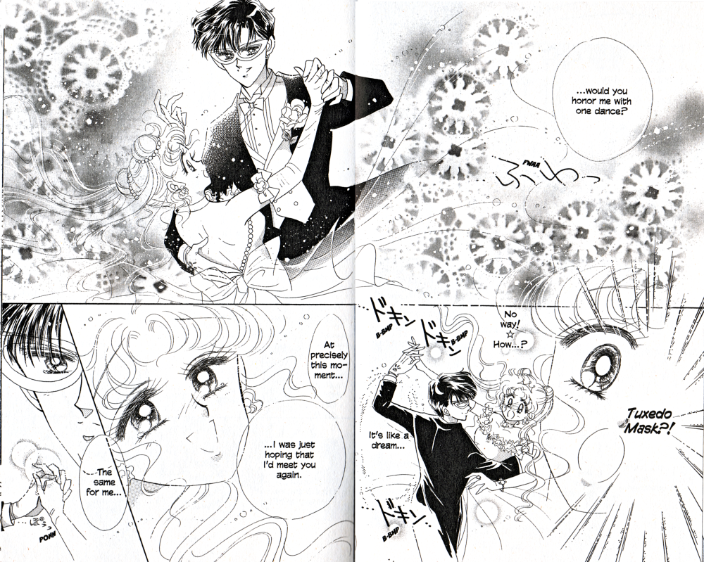
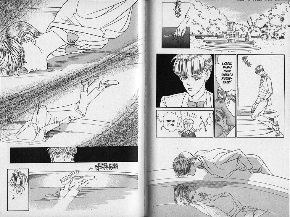
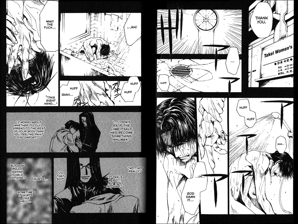
The first scene I’ve chosen comes in early in the volume, and it’s very obviously a dream world. The ever-present blossoms in the wind, Yuuko’s train of butterflies, the wind in the air, and even just the sense of space feels entirely like a dream–like something clearly outside our waking reality. It’s beautiful, but it’s expected, and even when there’s a sense of eeriness, it feels friendly and familiar.

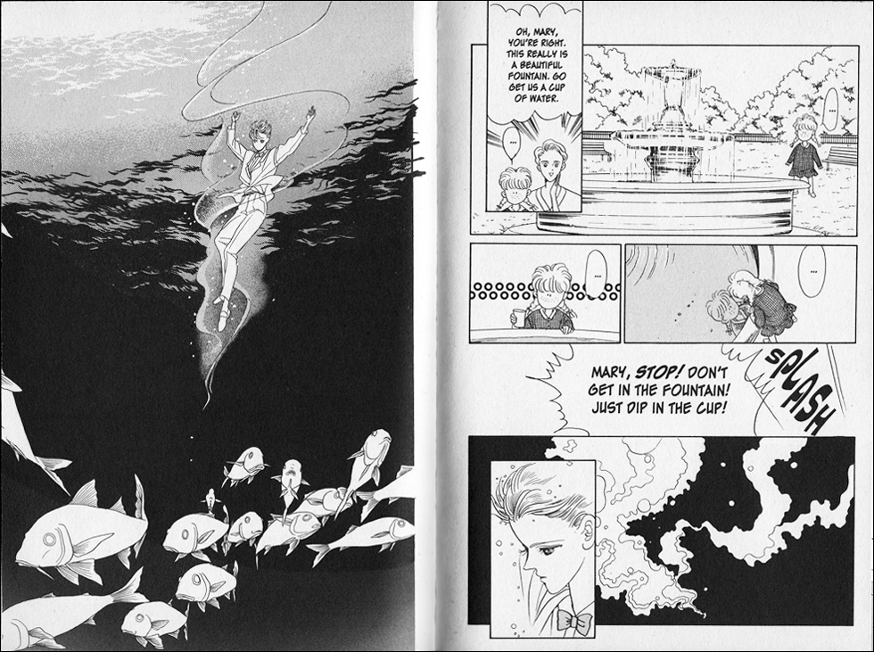
xxxHOLiC, Vol. 12, Pages 138-141 (Del Rey)

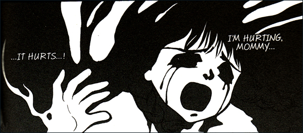
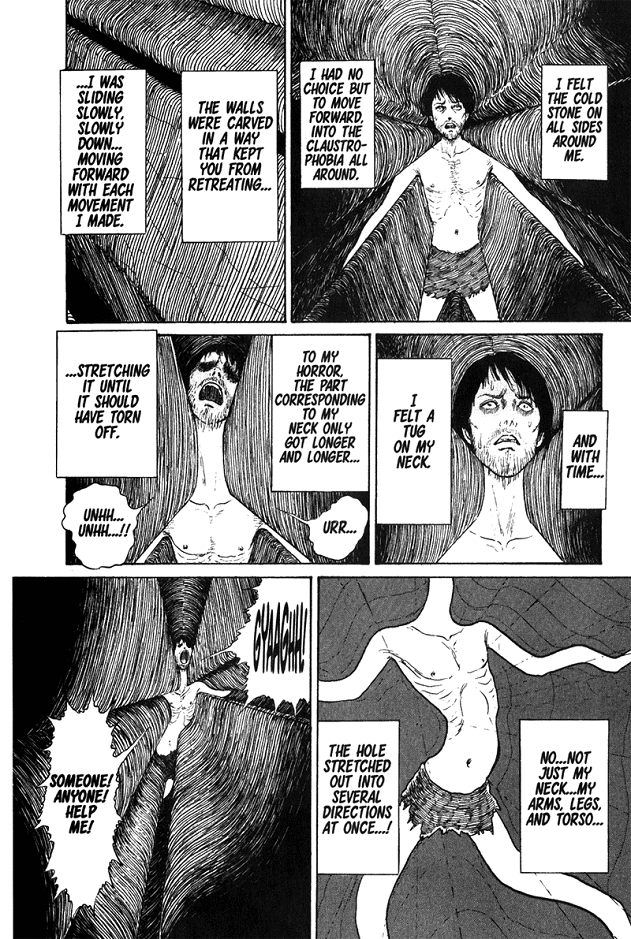
The second scene, on the other hand, comes in much later, when Watanuki is being shuttled from dream to dream to dream, never knowing if he might finally be awake. The scene starts out simply with the kind of lunch picnic he might have with Himawari any day of the week. The backgrounds are sparse and the panels sort of matter-of-fact. The only hint at first that something might be off, is the hole Watanuki notices in the wall behind Himawari. And even though the scene becomes comedic, with the scaly hand popping out of the hole to steal Watanuki’s sherbet, it feels very sinister to me–not just because Himawari never notices what’s happening, but because it’s intruding on what feels to Watanuki like normal life, letting him know that he’s somehow *still* not awake. Unlike the earlier dream scene, which feels so perfectly dreamlike, this one reads as something more like madness, which is much scarier to me as a reader.

MICHELLE: My first reaction when I saw the scaly hand stealing the sherbet was to deem it “cute” but that’s because it’s been so long since I read xxxHOLiC that I had utterly forgotten the context of this scene. Now that you’ve informed me, I read it as sinister. It’s definitely something that could look like “Watanuki’s everyday life” to the casual reader as much as to Watanuki himself, at first.

MJ: I probably am letting the context influence me, which maybe makes this not the greatest example for a Let’s Get Visual column! But I do think it’s interesting how differently CLAMP treats these two scenes, when they’re both representations of Watanuki’s dream world.

MICHELLE: Oh, I think they’re fine examples! What you’re basically showing here is that in xxxHOLiC, or at least in these scenes, CLAMP draws the supernatural in a way that blends in with the everyday world. It’s a very simple approach, free of some of the bells and whistles that my images from Legal Drug possess.

MJ: Well, let’s take a look at those, then!

Legal Drug, Vol. 2, Pages 40-43 (TOKYOPOP)

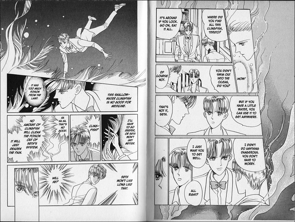
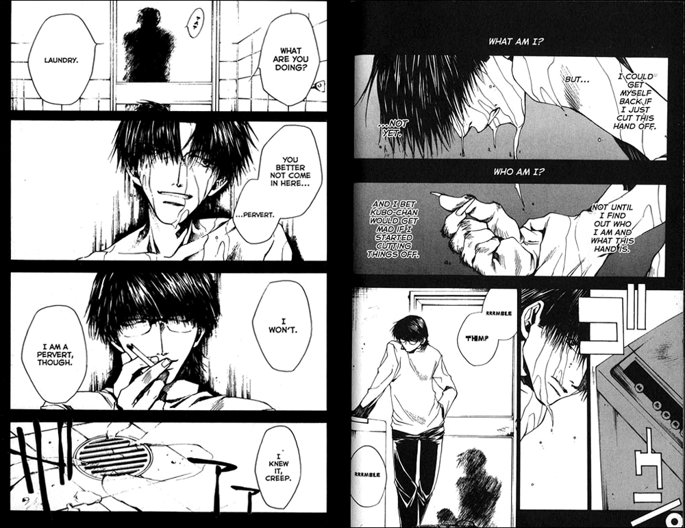
MICHELLE: These pages are from a scene in the second volume of Legal Drug. Kazahaya and Rikuo have just rescued a magical kitty, and in gratitude, the kitty has led them to the park where its powers are strongest and transformed into the images of the person each boy wants to see most.

What struck me strongly here is the way the kitty begins to unravel. Seriously, the fact that it’s just one little toe of his little paw really gets to me somehow. Somewhat like xxxHOLiC, there’s that feeling of “You thought things were normal, but really they are not.” As the transformation is underway, we get several reaction shots from the boys (with a bevy of speedlines), resulting in a page layout far busier than xxxHOLiC. The two-page spread is quintessential CLAMP: two slim and lovely ladies with long flowy hair speckled with white ink. The tight panels of the boys’ eyes include more speedlines to help convey their shock.

Honestly, besides the slightly more ornate style here, it’s the speedlines that really convey the biggest tonal difference between these series to me. It’s presumptuous to declare that CLAMP “matured” between the two series, but it really does feel as though they realized they no longer needed to rely on such tricks to convey the protagonist’s feelings. Less is more!

MJ: Well, I think it’s probably worth bringing up the fact that Legal Drug ran in a shoujo magazine, where those kinds of flourishes might have been expected, unlike xxxHolic, which had to fit in to the style of a seinen magazine. I mean, CLAMP is always CLAMP, but there’s always a clear sense of what demographic they’re drawing for–even in two series as similar as these.

MICHELLE: That’s a good point. I certainly don’t mean to disparage the style of Legal Drug or insinuate that it’s inferior, but in terms of personal preference, I simply like the cleaner, restrained style of xxxHOLiC more. I mean, just check out how the panel shapes themselves are different. It’s really neat to compare them!

MJ: Oh, I completely agree! And though I also have a preference for the artwork in xxxHolic, I do appreciate the shoujo flourishes for their classic flair. More and more, I find the differences fascinating, and I was really surprised, actually, at how easy it was to tell which demographic CLAMP was writing for simply by looking at the artwork of their series in preparation for this Feast. I don’t think I expected it to be so obvious.

MICHELLE: I wouldn’t have, either. But going forward I’ll be making a special point to notice how they adapt their style to the magazine!

Filed Under: FEATURES, Let's Get Visual Tagged With: clamp

Let’s Get Visual: Takehiko Inoue

June 30, 2012 by Michelle Smith and Anna N

MICHELLE: It’s been a while, but Let’s Get Visual has awoken from its hibernation in time to celebrate the Takehiko Inoue Manga Moveable Feast. Joining me for this occasion is special guest host Anna Neatrour, who is also co-hosting the MMF with me! Welcome, Anna!

ANNA: Thank you! I am excited to join in on a Let’s Get Visual post for Takehiko Inoue, because I think he is one of the top contemporary manga artists. He has an incredibly detailed and realistic style that really sets his manga apart from other series.

MICHELLE: I just started reading Vagabond the other day, and there was one close-up picture of Takezo drawn with extreme care and obvious skill, and I thought, “Y’know, this should be the image that all manga fans carry around to immediately dispel the misconceived notion that all manga looks alike and/or involves big, sparkly eyes.”

ANNA: I think that Inoue’s style (particularly in Real and Vagabond) is probably more reader-friendly to Western comics fans who haven’t read much manga before.

MICHELLE: Yeah, probably so. I’ve often thought that Western comic fans would probably like a bunch of seinen manga if they’d give it a chance.

Anyways, I suppose we should proceed to get visual! The images I’ve chosen are the very first pages in the very first volume of Real.

Real, Vol. 1 (VIZ Media)

I chose these images because they demonstrate how well Inoue is able to communicate Togawa’s character here without needing any words at all. Okay, sure, this guy is in a wheelchair, but he’s clearly driven. He’s pushing himself, possibly to the point of pain (if that’s what that one black panel represents). He has bulging muscles, so he’s clearly been at this a while. He’s moving fast. He may have a disability, but it doesn’t mean that he can’t take being an athlete seriously.

And then you turn the page and see that he is all alone. Inoue pulls back to show the entirety of the gym to emphasize Togawa’s solitude, and if that wasn’t enough, we get a glimpse of the empty school campus, as well. This sets the stage for what we later learn (which you mention in your review)—that Togawa’s attitude toward his wheelchair basketball team does not mesh well with his hobbyist teammates. Here’s a guy who is giving it his all, and he is the only one.

There’s just so much we can tell from this elegant introduction that it kind of blows me away.

ANNA: I agree that one of the things I like best about Inoue’s art is how much the images are able to contribute to the storytelling of his manga without overtly telling the audience anything. The themes touched on in the images you showed are addressed again later in the manga. Togawa’s ego and isolation contribute to his central struggle in the manga, and at the same time his willingness to practice all by himself shows just how dedicated he is to his sport.

MICHELLE: I will always, always be a big fan of nonverbal storytelling, so Inoue really wins my heart here by going above and beyond impressive art.

Want to tell us about the images you picked?

ANNA: The panels I chose were from Volume 26 of Vagabond, collected in the ninth VIZBIG edition of the series.

Vagabond, Vol. 26 (VIZ Media)

One of the reasons why I love Vagabond so much is that the fight scenes are never merely about two people fighting. There’s always a psychological or philosophical element involved. We see Miyamoto Musashi in a midst of battle against 70 members of the Yoshioka sword school, an ambush he willingly walked into. As he battles, he’s focused on centering himself and living in the moment. The close-up panels of his face show the process of self-reflection even as he is mowing down his opponents.

MICHELLE: That’s a really striking sequence. I like how he seems to be looking off into the horizon as he tells himself to have no aspirations for the future, as if to acknowledge the existence of other paths that he’s not allowing himself to take. Granted, I’ve not read the series that far—I’m barely on volume two—but it almost seems to me like he could walk away from this fight if he wanted to, but he’s not letting himself do it. Is that anywhere near the case?

ANNA: I don’t think Musashi is capable mentally of walking away from a fight like this. There are a lot of things that lead up to this sequence of many chapters where Musashi takes on the entire sword school, but one thing that struck me about the battle as a whole is that while you see Musashi getting beaten down and injured, towards the end Inoue almost has the reader concluding that it was really unfair to the 70 men who were planning on ambushing and attacking Musashi from behind that they had to go up against this one particular single opponent. Vagabond’s
fight scenes are always interesting, even when they stretch on for hundreds of pages, simply because the exquisitely rendered battles are contrasted with the internal struggles of the people who are fighting. Battle is as much of a mental exercise as it is a physical one.

MICHELLE: That’s an interesting point! So far I’ve only seen a few fights, and there hasn’t been much on Takezo’s (as Musashi is known at that point in the story) mental state yet. But I definitely admired the pacing and structure of Inoue’s artistic approach to battle—even watching Takezo just turn around and notice one opponent still standing becomes something frankly terrifying.

ANNA: One the things I enjoy about Vagabond is seeing the way Musashi changes over time. The man fighting the sword school in these panels has a measured sense of self and an inner stillness as he fights opponent after opponent. This is totally different from the way Takezo is portrayed in the earlier volumes, where he is more arrogant and animalistic.

MICHELLE: I definitely look forward to seeing how he gets from point A to point B. I admit, I still prefer Inoue’s sports-related series, but there’s just no denying that Vagabond is a masterpiece.

Thanks to everyone for reading, and we hope we’ve inspired you to check out some Inoue!

Filed Under: Let's Get Visual Tagged With: Takehiko Inoue, VIZ, VIZ Signature

Let’s Get Visual: The Jibblies

December 3, 2011 by Michelle Smith

MICHELLE: So, in our last installment of Let’s Get Visual we celebrated the pretty, so it seems only fitting that this time we devote our attentions to images that make us shudder with a feeling I like to call “the jibblies.” Just like beauty, creepy is a subjective thing, so we’ve each chosen a variety of images that get our personal hackles rising.

MJ, you want to go first this time?

MJ: Sure!

So, as I was perusing my manga collection for things that creep me out, it became increasingly clear to me that I’m very simple when it comes to what scares me. All it takes to really get to me is a single disturbing image–especially one that distorts something human into something sinister. I’m apparently not scared of monsters so much as I am of monsters in human clothing.

My first example comes from Setona Mizushiro’s After School Nightmare. In this series, a group of teenagers is regularly drawn into a shared dreamworld in which they each appear as physical manifestations of their own worst fears. Some of these are visually more disturbing than others. The series’ main character, Ichijo, for instance, most fears his own confusion about gender, so his skirt-wearing dream self is really horrifying only to him. Some of the other students, however, wear their fears in a much more visually distorted manner. This short spread features two of those students.

After School Nightmare, Vol. 1 (Go! Comi)

First, you’ll see a student who appears only as an arm and hand, twisting itself around Ichijo. Second, a girl appears with giant cavities replacing her face and chest. While the second of these has the most stunning, immediate affect on my psyche, the first creeps up on me as I try to move away from the page. Both images stick with me long after I’ve put the book down, and this seems to be the real key to scaring the bejeezus out of me. If I can’t get the image out of my mind, it easily haunts me for days. That’s the power of a single, shocking image.

MICHELLE: My first thought upon hearing of your aversion to “a single disturbing image” is that you shouldn’t read Junji Ito’s Uzumaki, followed by the thought that you should read it.

My reaction to the image above differs from yours, though, in that while these images certainly provoke in me an “ew” reaction, they aren’t the type that haunt me. I definitely think that the slinky arm creature is the more creepy in the image you displayed. For me, it’s because the gaping images of emptiness are immediately recognizable as symbols for what that character is feeling, but what on earth is causing that other student to appear like a grasping, creeping arm?! I feel like their circumstances in life might ultimately be the more disturbing! (This comes from someone who’s read only one volume of After School Nightmare, so I don’t know if this turns out to be the case.)

MJ: I think part of what makes the gaping holes in the second student so horrifying for me, is that (for whatever reason) I’m strongly affected by a lack of face. I have the same reaction to images of people with blank faces. It creeps the hell out of me when I can’t assess a person’s feelings/personality from their expression. It feels very threatening to me.

Perhaps it’s further evidence of how much a face means to me, actually, that both of my follow-up images are pretty much face-only. First, from CLAMP’s Tokyo Babylon, we have the face of a dead child who pleads with her mother to avenge her, and secondly, from Jun Mochizuki’s Pandora Hearts, the face of a girl that reveals itself to be a monster underneath.

Tokyo Babylon, Vol. 4 (TOKYOPOP)

Pandora Hearts, Vol. 1 (Yen Press)

I actually find both of these to be creepier than the images from After School Nightmare, though they are much simpler. Something they have in common is that they are presented against a stark, black background, giving the distorted expressions full focus. After that, though, they are nearly opposites of each other. The face of the girl in Tokyo Babylon is all too real, distorted by the power of raw emotion, while the character in Pandora Hearts is revealed to have no emotion at all, or at least none that matched what was on her false human face. Yet in the end, which is more monstrous?

MICHELLE: It’s interesting how much the things that creep us out reveal about us, isn’t it? I’d wager you get the same threatening feeling from the girl who is revealed to be a monster underneath as you do the girl with no face at all. People pretending to be what they’re not, hiding their real selves, etc. That’s definitely something all of us have experienced at one time or another.

Getting back to actual attempts at visual analysis, those deep black backgrounds really do focus the reader’s eye on what the mangaka wants them to see. It’s as if they’re saying, “I don’t want you to be distracted by anything else.”

MJ: Your analysis of me is spot-on, that’s for sure!

And yes, I think the black backgrounds achieve exactly that, while also evoking our natural fear of the dark, or what we can’t see. It’s a powerful tool for both showing us something and not showing us something, if that makes sense.

MICHELLE: It definitely does.

Now I’m reflecting on what the images I’ve chosen say about me. There’s hardly a face among them, for one thing, because I am less creeped out by shocking images than I am by imagining an experience, specifically an experience during which one is forced to endure something horrible for a really, really long period of time with no means of escape. Ugh, just thinking about the short story my images come from—”The Enigma of Amigara Fault” by Junji Ito—has given me the jibblies while typing this paragraph!

Gyo, Volume 2, “The Enigma of Amigara Fault” (VIZ Media)

Page 178

Page 185

Page 198

Page 203

Page 204

I’ve chosen this particular sequence of images from this short story because they illustrate the entire plot without me needing to introduce it beforehand. By now you probably don’t need me to explain that when the TV news reports on a mountainside full of people-shaped holes revealed by a recent earthquake, people flock to the site and can’t be dissuaded from climbing into their personal holes, where long, icky agony awaits them. At first the site seems innocent enough, if a bit strange, but soon people are walking into holes, having nightmares about what happens to you in a hole, and eventually discovering the exit and…. Holy crap, it’s terrifying. This is the kind of thing that will haunt me for ages.

I’m honestly trying to analyze Ito’s artistic techniques dispassionately here, but I find that the disturbing power of the images is so great that it is affecting my ability to reason even now!

MJ: Hmmm, I’m wondering if what it’s saying is that while I’m terrified of people betraying me, you’re terrified of your environment betraying you. Or something like that.

In any case, these panels are undeniably creepy. Even if they creep me out in a less personal way, I can certainly see what’s giving you the jibblies! Interestingly, we again see the human form distorted, though in this case it’s happening sort of *to* the character we’re relating to rather than in front of him. (Maybe I’m afraid of the people I trust being compromised, and you’re afraid of yourself being compromised?)

This has a Twilight Zone feel to me, where some unexplained supernatural phenomenon is turning the lives of ordinary people into a nightmare. The artist does a great job of evoking the real terror of what’s happening, too. The texture of the stone walls around the man gives the images a three-dimensional look that makes it feel more real than a lot of what we see in manga. It’s the only thing that has that kind of thick texture, too, so it really stands out.

MICHELLE: More like I’m terrified of taking a step that can’t be undone and ending up in eternal torment because of it!

And yes, now that I’ve regained my senses, I agree that it’s the realistic three-dimensional detail that really makes it so disturbing. The details of the setting itself establish it firmly in the here and now, and then we’re shown that within the here and now exists something completely alien and unexplainable! Regarding the texture of the stone walls… it’s that bit of dialogue about how they’re carved to prevent backtracking that really gets to me. It’s mute, immobile stone, and it’s going to be your tormentor for the next several months, slowly inflicting more gruesome horrors upon you than something living could ever do. Uh-oh… jibblies.

MJ: There, there!

MICHELLE: Thanks. I also really love the bottom left panel on page 185, when you see the outside world from inside the tunnel. Interestingly, this is an angle from which the guy who just entered the hole could never have seen the characters. He’s got his back turned to this world, and is resolutely leaving it behind. And, too, I love the “less is more” approach here. We don’t see the distorted figure actually emerge from the mountain and thrash around terrorizing people. One glimpse is enough to confirm what has happened. It’s almost kind of elegant in its structure.

MJ: Yeah, I agree, the threat of what is about to happen is actually scarier by itself than it might be if we actually saw it happen. Or at least it’s creepier that way.

MICHELLE: Well, I fear this column has actually been more about us than the art, but it’s been the art that made us feel that way, and that’s something, isn’t it?

MJ: It is!

MICHELLE: So, that’s it for us this month. What gives you the jibblies?

Filed Under: FEATURES, Let's Get Visual Tagged With: Junji Ito, VIZ, VIZ Signature

Let’s Get Visual: Celebrating the Pretty

October 2, 2011 by Michelle Smith

MICHELLE: The long-awaited return of Sailor Moon has inspired us to devote this month’s column to classic shoujo art, focusing on a celebration of its sheer prettiness. Normally, we try to be astute in these columns—their whole purpose is to provide experience in seriously considering the artistic merits of manga—but it’s possible that this time we’ll be reduced to just sighing happily.

MJ: Yes, it’s quite possible indeed. But honestly, I think that’s valuable in its own way, and maybe we’ll end up learning a little something about why these things make us sigh happily.

MICHELLE: Perhaps so!

So, for my contribution I’ve chosen two memorable moments from the first volume of Naoko Takeuchi’s Pretty Guardian Sailor Moon. The first one comes from a chapter in which the protagonist, Usagi Tsukino, has infiltrated a masquerade ball in an effort to determine whether the Legendary Silver Crystal might be found there. Possible foe/possible ally Tuxedo Mask is also on the crystal’s trail, but pauses to give Usagi a twirl on the dance floor.

Pretty Guardian Sailor Moon, Volume 1, Chapter 4, Pages 142-143 (Kodansha Comics)

Takeuchi’s art perfectly captures the sheer dreaminess of this encounter for Usagi. In the top panel, the lacy screentone mimics the flare of her skirts, and the way that the smaller panels are framed focuses attention on facial expressions and reinforces the feeling that no one and nothing is capable of intruding upon this perfect moment for them.

And, of course, her dress is purty.

MJ: This sequence truly is dreamy. What particularly pulls me in here is the screentone. Its texture brings a 3D quality into this 2D world, as though the moment was preserved and wrapped up in an elaborate scrapbook that I could reach out and touch—as though it was someone’s real memories of the moment. Even just looking at something that has such a familiar texture stimulates my sense of touch, bringing me more fully into the scene. I think this kind of tangible decoration not only lends a fairy-tale dreaminess to the scene, but also makes it feel more personal for the reader.

MICHELLE: Ooh, you’re right, it does feel like a page from a scrapbook! In that sense, the screentone almost seems like it represents a snippet of the actual material of Usagi’s dress.

In addition, Usagi has used her transformation gadget for this chapter and is supposed to appear a little older than usual. I think her expression on the lower left page captures that subtle distinction nicely.

MJ: I’ll note too, that while this particular brand of big-eyed shoujo tends to get a lot of flack outside shoujo fandom, that it’s Usagi’s big, shining eyes that really let us know how she feels here, and just how dreamy this moment really is for her (and subsequently for us).

MICHELLE: You know, I think I’ve become inured to the big-eyed thing, except with extreme cases, because I don’t even notice it anymore. It just seems like such an obvious way to convey youth and wonder.

My second “memorable moment” is an example of a Sailor Moon action sequence.

Pretty Guardian Sailor Moon, Volume 1, Chapter 5, Pages 188-189 (Kodansha Comics)

In its way, this selection is just as pretty as the other one. Luna tosses Makoto her transformation pen, which glows in an appealingly magical girl fashion, transforming the girl—who is somewhat insecure about her physique—into Sailor Jupiter, someone both beautiful and powerful. Meanwhile, the enemy lurks on a nearby rooftop, and I’m impressed how this single panel so effectively establishes setting and atmosphere when one doesn’t have the preceding pages to furnish that information. Makoto’s first attack is simultaneously feminine and effective, giving her the opportunity to vanquish the enemy with her thunder bolt on the next page.

Looking back at some of the adjectives used in the paragraph above, I find that they aptly convey what it is I like about this moment: beauty and power, femininity and effectiveness. Sailor Moon shows that these things need not be mutually exclusive.

MJ: Those are great adjectives, Michelle, and actually this brings up a point I’ve been wanting to make since I listened to the podcast you participated in about Sailor Moon.

When male manga fans are trying to explain why something written for girls might be appealing to them as well, they will often attribute this to what they perceive as male or “shounen” elements in the story, like team-building or action sequences. And while I appreciate their enthusiasm for the work, I’m a bit perplexed as to why these would be considered exclusively “shounen” to begin with. Sure, certain genres of shoujo manga might share these things in common with certain genres of shounen manga, but I honestly don’t see what’s not inherently shoujo about them. Girls enjoy things like action, adventure, teamwork, and battling evil just as much as anyone, and there’s nothing odd or incongruous about these elements standing alongside things like beauty and femininity. These things naturally coexist in the minds of many girls, and when they’re all put together, they are not only exciting and inspiring, but really freaking pretty.

MICHELLE: You’re right, and though I agreed with them that there were some “shounen” elements to Sailor Moon, I didn’t mean to imply that they’re not just as easily shoujo elements, but simply story aspects that are more common to shounen manga. If that makes sense.

MJ: I guess what I’m saying is, though maybe there are more shounen action series than there are shoujo action series, it’s not as if it’s uncommon in shoujo. The entire magical girl genre pretty much exists in that realm, and those series share as much or more in common with fantasy, adventure, or sci-fi shoujo like Basara, X/1999, or They Were Eleven as they do with shounen manga—all of it very shoujo and very pretty.

I don’t mean to derail this discussion with my shoujo manifesto, though, so please forgive me. I’m just happily overwhelmed by the sparkly loveliness of this action sequence.

MICHELLE: No worries; I agree with you. But perhaps we should move on. What pretty shoujo have you chosen?

MJ: Well, it may seem like an odd choice, given the vast pool of classic pretty to choose from, but I’ve chosen an 8-page scene from volume three of Reiko Shimizu’s Moon Child, and there are a number of reasons why.

Moon Child, Volume 3, Pages 146-153 (CMX)

First, of course, there is quite a bit of objectively lovely imagery in the later panels of the scene, including rippling water, a flowing seascape, and a billowy-haired mermaid, all rendered with a perfect balance of simplicity and detail. I’m particularly fond of Shimizu’s style of character design as well, which is very much in step with most of the ’80s and early ’90s manga I’ve read. For whatever reason, this is probably my very favorite period for shoujo character design.

Most of all, though, there is an eerie, vaguely melancholy tone throughout the entire scene, particularly the first two pages, which I will admit are my favorite. I even consider them the prettiest of the whole sequence, though they have none of the flowing seascape that decorates the rest of the scene. They are, however, beautifully strange, and a perfect example of what I personally find prettiest in shoujo manga. This may seem like an odd thing to say, but I find the strangeness—this particular brand of strangeness—to be really, really beautiful. When I look at the first two pages of this sequence, I can feel the smooth surface of the water as the character brings his face near, touching the ends of his hair and the tips of his nose and chin. That smooth pool of water and the way he just falls slowly into it—it’s difficult for me to articulate exactly why I find it beautiful, but I really do.

Yes, I love these character designs, and the pretty page layouts, but sometimes what I find most beautiful about older shoujo manga is its strangeness. It brings to mind a dreamworld, I guess—one that looks like our world but somehow just isn’t in a way that engages the most obscure, most beloved corners of my imagination. These stories make themselves part of my private world, and I find them beautiful for it. If that makes any sense at all.

MICHELLE: It absolutely makes sense. And for what it’s worth, I studied the pages before I read your commentary and also felt that the exquisitely slow descent into the fountain was the loveliest part. I like, too, how Teruto slips into the fountain with such grace and barely a ripple and how this is contrasted off-panel by the little girl who has observed what happened. The inability of an everyday person to access the same magic only reinforces its strangeness.

MJ: Yes, exactly! It seems so clear that he exists in a different state of being from the regular people around him, which is part of what makes it feel so dreamlike, I think. There is a lot of that kind of thing in this series, which is really, exquisitely strange. I think the dreamlike tone makes it easier to suspend disbelief as well.

MICHELLE: From the examples we’ve both chosen, it seems that, to some extent, it’s the dreaminess of pretty scenes that is at least partly responsible for the happy sighing. Of course, we realize that real life is seldom so lovely, but it’s nice to abandon oneself for a while in a reality where that sort of thing really can happen.

MJ: I think where I often find solace in shoujo manga, is that it offers exactly what you describe—a reality that contains the stuff of dreams—but held together by real human feeling, such that even the wildest tale can often shine much-needed light on our real-life emotional turmoil. At the heart of all this strange, sparkly fantasy, there is a solid base of real emotional truth, which is sometimes easier to face when it’s presented in a pretty, dreamlike package.

MICHELLE: Well put! I think that’s one of the major strengths of genre fiction in general, actually, no matter the media.

MJ: Agreed! Of course, nothing does “pretty” quite like classic shoujo.

MICHELLE: Indeed not. That’s just icing on the cake!

Filed Under: FEATURES, Let's Get Visual Tagged With: cmx, Kodansha Comics, Naoko Takeuchi

Let’s Get Visual: Fruits Basket

July 30, 2011 by Michelle Smith

MICHELLE: So, we’ve been talking about Fruits Basket all week, but I’m certainly not yet weary of the topic. How about you, MJ?

MJ: I suspect I could discuss Fruits Basket for weeks on end!

MICHELLE: Me too. We’ve already discussed the general awesomeness of the story and characters this week, but one thing we haven’t talked much about yet is the art. Takaya’s style evolves a good bit over the course of the series, and while I used to think I preferred her earlier style, I’ve lately realized that that is not the case at all. Do you have a preference yourself?

MJ: Hm, well, I definitely appreciate the prettiness of the series’ early volumes, and I do think there is some detail lost later on, but one thing the series never lacks is expressiveness, and that goes for the artwork as much as anything else.

MICHELLE: I think the expressiveness actually improves later on, at least insofar as Tohru is concerned, since she loses those really, really, really big eyes of hers. I will forever mourn the changes to my beloved Hatori, though, who goes from looking like this to looking like this.

It’s not that he’s become unattractive; he’s just lost a certain bishounen quality that I had certainly appreciated.

MJ: I do think Takaya does a wonderful job of aging the characters subtly over the course of the story, and I’m not necessarily just referring to their physical ages. I think she matures them overall, letting their outsides reflect their insides.

MICHELLE: That is definitely true, especially with Kyo, Yuki, and Momiji. Probably Momiji most stunningly of all.

MJ: Yes, there is quite a bit made of Momiji’s growing up, isn’t there? And though it’s more difficult to see that transformation as “subtle,” it’s certainly striking and oddly poignant.

MICHELLE: Takaya really does well with “striking” and “poignant,” doesn’t she? Which leads us to our specific picks for this month’s column!

Many of the most powerful and affecting moments in Fruits Basket occur between just two characters. To exemplify this trend, MJand I have both chosen scenes starring only Kyo and Tohru.

MJ, why don’t we start with you?

Volume 15, Chapter 87, Pages 129-134 (TOKYOPOP)

MJ: Okay, well, I’ve chosen a scene from late in volume fifteen. After losing his temper in a confrontation with Yuki, Kyo returns to his classroom to find Tohru waiting for him, alone. In terms of script alone, the scene is not especially remarkable. There are some dramatic moments in Kyo’s inner monologue, but they’re both being careful not to *say* anything out of the ordinary. What makes the scene really work, though, is their body language.

At this point in the series, both Kyo and Tohru are just barely beginning to realize how they feel about each other, and Takaya plays this beautifully. The way Tohru lights up the moment she realizes Kyo is in the room, Kyo’s impulse to lean against her, their excited nervousness about being close, and especially Tohru’s last page alone—you can actually feel the tension between them in every panel. It’s so well done.

I especially like the last panel, with a flushed Tohru hurrying out of the frame. Somehow, leaving us with the empty space behind her keeps us lingering in the moment, much as she would herself, if she hadn’t been called away. There’s a sense there that the moment still looms large for her, too, even as she’s hastily left it behind, emphasized by the flowers still present in the frame. Like her absence in the frame is saying, “Really intense and possibly scary feelings happened here… run away, run away!” Does that make any sense?

MICHELLE: It absolutely makes sense! I’m always interested in how mangaka use open space, and I think you’re quite right that in that final panel it’s being used to keep us in place while Tohru dashes off. On the first page, the oddly tall panel of Tohru alone in the classroom employs empty space to emphasize how she really is the only one there.

This example reminds me of your pick for our “Duds” column, Baseball Heaven, and how the artist in that case utterly failed to establish convincing body language between two characters who were meant to be attracted to each other. Perhaps Ellie Mamahara needs to read more Fruits Basket!

MJ: Oh, good call, Michelle! Yes, that’s the perfect choice for contrast here. Everything that’s missing in that scene from Baseball Heaven is demonstrated spectacularly here, and as a result, this actually plays as a love scene much more convincingly, despite not actually being one. Even the use of small frames to emphasize the hand or face—something that just felt distracting and fragmented in Mamahara’s scene—adds to the tension here. It’s wonderfully done.

So what about you, Michelle? What scene did you choose?

Volume 22, Chapter 128, Pages 96-99 (TOKYOPOP)

MICHELLE: The scene I’ve chosen is from volume 22, quite near the end of the series. Tohru has been hospitalized and her friends have barred Kyo from seeing her while she recovers, since she gets stressed at the mention of his name.

As Kyo makes his nervous way to the hospital, the size and shape of the panels reflect his mental state. They’re cramped, dark, and dominated by his inner monologue. “Do I really still like her? What do I like about her?” We catch incomplete glimpses of the things Kyo passes on his journey, because he is so wrapped up in his thoughts that he too is hardly noticing them. Finally he arrives at the hospital, and the tension as he catches Uotani’s eye is palpable.

And then… Tohru appears and the world falls away. Suddenly, everything is so clear. The doubts are wiped away as if they have never been, because the minute he sees her, it is so very simple. “I love her.” Even as Kyo’s focus narrows to include only Tohru, the pages still have a wide-open and airy feeling that suggests gentleness and infinite possibility. This is the first time Kyo has really allowed himself to acknowledge these feelings, and it’s so beautifully done that it gives me goosebumps.

MJ: Oh, absolutely, I have the same reaction here! Everything you’ve said about the size and tone of the panels is exactly spot-on. Also, watching Kyo’s face the few times we see it is striking, panel-to-panel. His first expression, as he’s approaching the hospital, is one of extreme trepidation, and it feels to me that he’s sort of hiding behind his bangs. He doesn’t want to be seen by anyone, especially someone like Uotani, whose gaze he reacts so intensely to. He’s terrified of his own feelings and of screwing things up, and he knows that he’s historically bad at dealing with emotional situations. He’s simply terrified on all fronts.

Then, when he sees Tohru, all of that just drops away, leaving him with an expression of pure longing and vulnerability we’ve really not seen on him before. Just as the air opens up, so does Kyo, completely unguarded for one long moment. It’s really stunning. I think both of these scenes we’ve chosen would play just the same with all the text removed—they’re so much driven by the emotion in the artwork.

MICHELLE: Longing, vulnerability and sheer wonder, I think. :)

And yes, I think we have a knack for picking scenes where text is not really necessary. Even here, body language is certainly telling a lot of the story for us, even in small ways like Kyo’s tensed, half-flexed arm and clenched fist as he finally reaches his destination. You can almost see him willing himself to get through this without messing up.

MJ: There’s just so much emotional nuance here, in every panel. When I’m reading scenes like this in context, these are details I don’t consciously notice as I let the emotions just sweep me along, but when we actually take the time to break it down like this, I can’t help but be amazed by how much thought has gone into each line on the page.

MICHELLE: Me too. It sounds like we’ve convinced ourselves that, yet again, Fruits Basket is awesome.

MJ: Indeed we have!

MICHELLE: Thank you, MJ, for joining me once again! And to those reading this column. Do you have a favorite artistic moment in Fruits Basket? Tell us about it in the comments!

Filed Under: FEATURES, Let's Get Visual Tagged With: natsuki takaya, Tokyopop

Let’s Get Visual: Wild Adapter

June 25, 2011 by Michelle Smith

MICHELLE: Hey, MJ, did you know there was a Wild Adapter MMF going on?

MJ: I’ve heard rumors to that effect. Terrific series, Wild Adapter. Whoever is hosting it must have great taste!

MICHELLE: I’m relieved you think so, because in honor of the Feast, we’re devoting this month’s Let’s Get Visual column to that series!

MJ: We are? Oh! Yes, we are!

MICHELLE: One of the hosts has already done an admirable job scanning some of the many significant images from the series (at great personal cost) but that won’t stop us from talking about a few more.

In Wild Adapter, creator Kazuya Minekura tells her story through the eyes of observers. Sometimes these figures are opposed to our main protagonists—Makoto Kubota and Minoru Tokito—in some way, such as the detective in volume four or the new youth gang leader in volume six, and sometimes they are with them, either in a personal way (their young neighbor Shouta in volume five) or a more business-like fashion (Takizawa the journalist in volume three). In every case, though, we rely on their interactions with Kubota and Tokito to learn more about said fellows, since we are denied access to their thoughts.

As I reread the series, I noticed that Minekura also uses her art to support this narrative choice, and that she, in particular, uses a similar device several times where Kubota is concerned. (Click on images to enlarge.)

Volume 2, Chapter 11 (TOKYOPOP)

Here, Tokito stops Kubota, who has violently come to his rescue. Kubota instantly sheds any vestige of excitement, and throughout this two-page spread, his eyes, like his thoughts, feelings, and motivations, remain shielded. He’s distant and aloof. Yet when Saori suddenly realizes that Kubota is the one who’s possessive of Tokito, he offers her a small smile. She finds the experience scary, and I agree that it could be construed as an ominous expression, but it’s also a stunning moment of access to what Kubota feels.

MJ: I agree that it’s a stunning image, and while I can appreciate Saori’s response, like you, I’m mostly fascinated. As you say, Kubota is a character who deliberately shuts himself off from other people, and now, as we’re granted this tiny moment of access, it becomes really clear why. In these rare moments, with just a small smile and a real look into the eyes, he’s suddenly wide open to us, and the guy that we see in there is nothing like the person he displays the rest of the time. And that’s a guy he really doesn’t want people to know. Maybe he thinks that guy is scary, I don’t know. But it’s clear that when he does grant access, he’s pretty much an open book—probably more so than characters who are generally open to begin with. Does any of that make sense?

MICHELLE: It does, and you’ve provided me with an excellent introduction for my next example!

Volume 3, Chapter 18 (TOKYOPOP)

This scene takes place near the end of volume three, during which Kubota and Tokito have infiltrated a cult that they erroneously believe is connected to Wild Adapter. Here, the guys are looking very casual and cozy, and while Kubota admits to Tokito that he has become more human, he does it while facing away from the audience. We see the back of his head and a hand holding a cigarette as he speaks. This is a moment reserved for he and Tokito alone.

Kubota doesn’t say it outright, but it’s clear that it’s Tokito making him feel this way. And when Tokito goes on to lament their progress in their investigation, the warm and open-eyed smile of Kubota’s at the bottom of page two makes it clear he hasn’t yet changed mental gears. He’s still thinking about Tokito.

MJ: To me, these soft, openly caring eyes are just as much of a shock as the more terrifying look we see in your first example. It’s clear that both of these looks are genuinely Kubota, but you get the feeling that Tokito is the first thing that’s ever inspired the feelings behind this look.

I have to really admire Minekura’s skill with expression here, too. Though some aspects of her artwork are very detailed, she actually doesn’t include a lot of detail when it comes to eyes. Yet what she’s able to do with just the barest nuance is, frankly, incredible.

MICHELLE: But wait, there’s more! Minekura uses this technique again in volume four, with very different results!

Volume 4, Chapter 22 (TOKYOPOP)

Here, we see Kubota being interrogated by Hasebe for a murder that was committed in a hotel. Kubota’s not giving up any information, so it makes perfect sense that he would be evasive, as indicated by the closed eyes on the first page. Hasebe continues to push, however, and Kubota finally gives up pretense and opens his eyes, allowing us access once more. Only this time, we’re not seeing a warm and friendly Kubota; we’re seeing a coldly resolute one. The grey screentone over his face emphasizes that this is just a partial disclosure—he’s revealing the extent of his determination, but anything else is still off-limits.

MJ: It’s the narrowness of his gaze that really achieves this effect, but again, it’s done with most subtle detail. And you’re right, he’s giving the detective just exactly as much as he wants to give him, no more, no less. It really gives you a strong sense of how carefully he controls everything about himself, and just how rare the two previous examples really are.

MICHELLE: Yes, you’re quite right! The amount of openness Kubota will permit with other people is infinitesimal compared to what Tokito is allowed to see.

Well, that’s it for me and Kubota’s eyes. What images did you want to talk about?

MJ: I’d like to talk about a scene from the end of volume two. It’s one I’ve discussed a couple of times before, both in my initial review of the series and in my infamous post on “intimacy porn.” It’s one of my favorite scenes in the series, and I’ve already explained quite a bit about why.

Volume 2, Chapter 12 (TOKYOPOP)

As you can see, Tokito has hidden himself away in the shower to deal with pain in his claw hand, and as he wrestles with both the physical pain and emotional turmoil the hand causes him, he realizes that Kubota is on the other side of the shower door, doing laundry.

When I’ve talked about this scene before, my focus has always been on the incredible intimacy of it, and how beautifully Minekura creates this intimacy while putting a physical barrier between them. What I’ve never discussed before, however, is the detail that, in my view, is almost solely responsible for bringing us into the scene as readers, and that would be the sound effects.

I have no idea what the sound effects really say. I don’t read Japanese, and I haven’t asked anyone to interpret them for me, but really, I don’t have to. It’s actually the visual effect of the Japanese sound effects that makes them so effective.

We feel it from the beginning, with just Tokito—the soft sounds of the shower accompanying his thoughts. Then the rumble of the washing machine joins in as Kubota enters the scene. By the end, we’re surrounded by it all, the soft shower and the muffled rumbles of the machine, creating a shell of sound around the characters, isolating them from the rest of the world, but including us as intimate onlookers.

I’m always impressed by writers and artists who can create a real sense of place on the page, and Minekura has done this by surrounding us in these familiar sounds. We can imagine ourselves in the room—feel the rumble of the washing machine under our feet and the thick humidity of the steam as it wafts out around the edges of the shower door. It’s so beautifully done.

MICHELLE: Oh, I love the image of a shell of sound. I like, too, how the initial thump of the washing machine literally intrudes onto Tokito’s thoughts in the way that the sound effect bleeds over the edge of its panel and onto the next, where Tokito, with water streaming down his face, has now been momentarily distracted.

MJ: Yes, I love that frame you’re talking about, where the sounds of the washing machine suddenly intrude into Tokito’s thoughts. It’s as though the washing machine has spoken up to say, “We can hear what you’re thinking in there, and yes, he would be angry if you cut off your hand.”

MICHELLE: Do you actually want me to tell you what the sound effects say? Or is it better not to know?

MJ: Sure, tell me!

MICHELLE: The first one you see, and the one that appears most often and prominently, is “zaa,” which is frequently used alongside rain or falling water. It’s the “a” sound that travels down that first page and drifts across the final two-page spread. On the second page, when Tokito clenches his hand in pain, the sound effects say “zukin zukin,” or “throb throb.”

I was unfamiliar with the “goun” sound accompanying the first image of the washing machine, so consulted Google and found a site that helpfully describes “goun” as “the sound of a washing machine.”

MJ: Ah, helpful indeed.

MICHELLE: One of my motivations for teaching myself kana in the first place was to be able to decipher untranslated sound effects. It slows me down, reading each and every one, but it does add something to the atmosphere, I find.

Another thing I notice in this example is how Minekura treats the “zaa” sound effect, allowing it to trickle down the page along with the water in the first instance, and in the last, depicting it wafting laterally past Kubota, almost like escaping steam.

MJ: What’s really amazing to me, is how successfully this effect is achieved even without understanding the kana. The visual representation of the sound is so powerful all on its own.

MICHELLE: Definitely. Even if the sound effects weren’t there at all, one would still imagine the sound of running water. Their presence emphasizes the sound and its insular quality, though. I’m reminded of an earlier column, where we talked about the sound effects in Banana Fish. There, an image of a passing train automatically conjured the associated sounds, but the sound effects, through their domination of the page, took it to the next level by mirroring how the sound dominated the moment for the characters.

MJ: Here, the sound sort of cradles the moment, creating a sense of comfort and familiarity around something extremely vulnerable.

MICHELLE: Ooh, good verb. In both cases, the sound effects define the sound in some way, rather than simply reiterating that it’s there.

MJ: When I first started reading manga, I found sound effects distracting. I was so new to comics, I had a lot of trouble digesting all the visual information on the page, and sound effects just made that more difficult. Over time, however, I’ve come to appreciate just how much they contribute to the atmosphere of a scene, and how powerful they can be in the right hands.

MICHELLE: It’s like this whole other tool in the mangaka’s kit, and one that we don’t automatically think about.

MJ: Well said!

MICHELLE: Which brings us back around to the inescapable truth that Kazuya Minekura is brilliant and everyone should read Wild Adapter.

MJ: Yes, they should!

For more reviews, roundtables, and essays on Wild Adapter, check out the complete MMF archive.

Filed Under: FEATURES, Let's Get Visual Tagged With: Tokyopop

Let’s Get Visual: Mono no Aware

May 28, 2011 by MJ

MICHELLE: It’s the last Saturday of the month, and that means it’s time for another Let’s Get Visual column! Joining me as always is MJ, from Manga Bookshelf. This month, we’ve chosen images that convey the feeling of mono no aware, which Wikipedia defines as, “the awareness of impermanence, or the transience of things, and a gentle sadness (or wistfulness) at their passing.”

If I’m interpreting that definition correctly, there appears to be a subtle difference between mono no aware and outright nostalgia, where the former is more of-the-moment (Honey and Clover springs to mind here) while the latter would be something like the retrospective narration in Ai Yazawa’s NANA.

What’s your take on it, MJ?

MJ: I actually feel rather unclear myself, so I’m hoping that between you and our generous readers I’ll gain a better understanding via this column. Though I’ve read the Wikipedia entry, along with several other web pages that attempt to explain the concept, I’m not entirely sure I understand the true essence of mono no aware. I’ll do my best, of course, to take a stab at it!

MICHELLE: As will I! And if we do get it wrong, generous readers, please go easy on us!

What images have you chosen to talk about? (Click images to enlarge.)

Blue, Pages 224-end (Fanfare/Ponent Mon)

MJ: Well, since we do focus on visuals here, I chose a series of panels from the end of Kiriko Nananan’s bittersweet yuri romance, Blue, published in English by Fanfare/Ponent Mon. To a great extent, I think the entire manga exemplifies mono no aware, at least as I understand it at this time, as its primary romance seems obviously transient from the beginning. There’s never a sense that its protagonists, Kirishima and Endo, have a long-term future together, so the tone is wistful throughout. Every detail, down to the artist’s stark drawing style, suggests a gentle melancholy, even in the characters’ happiest moments.

As you can see, the story’s final pages are nearly text-free. After exchanging restrained parting words, Kirishima rides off to Tokyo in a train, leaving Endo on the platform, smiling sadly. As the train pulls away, Kirishima turns and leans against the door, finally letting her tears fall, unseen by Endo.

Not only do these panels express the sadness of an (apparently) inevitable parting, but they deliberately display this in the simplest, most beautiful way possible. Nananan’s barely toned artwork accents the slightest movement, giving enormous weight to a single teardrop–even to a single fold in Kirishima’s clothing. This sadness is elegant in every way, down to the strands of black hair tumbling over Kirishima’s fingers in the books’ final frame. It’s gorgeous, truly, and so simply bittersweet.

Though, as I’ve said, I’m not entirely sure I fully understand mono no aware, these panels perfectly illustrates what I think it might be. I hope someone will tell me if I’m wrong or right.

MICHELLE: I think you’ve got it right, because we can tell that Kirishima realizes that this is the last time she is going to see Endo. She still loves her, but their time together is over. It’s a very sad scene, but it’s also a beautiful scene, and because this heartbreaking moment is depicted with such care and such clarity, I think it qualifies as mono no aware.

MJ: I’m relieved to know that you think so!

So what have you chosen to share with us tonight?

Shugo Chara!, Volume 10, Pages 148-149 (Kodansha Comics)

MICHELLE: I’ve chosen a two-page spread from the tenth volume of Peach-Pit’s magical girl series, Shugo Chara!. The series has followed its protagonist, Amu Hinamori, since she was in the fourth grade, and now her final days of sixth grade are drawing nigh. She and her friends are responsible for planning the graduation ceremony and Amu has gone to check out the state of the auditorium.

When she gets there, Amu is stunned by the sight of a room full of empty chairs. It’s silent and still, and its emptiness is only emphasized by the barrel ceiling. The sight reminds her of the many things that have happened at school and with her new friends, times when this room was full of life, but there’s more to it than that. There is still one more occasion where they will all be together—graduation. Things are not quite over for them, this room will once more be peopled by those whom Amu cares about, but still, the knowledge that change is imminent makes Amu wistful somewhat in advance.

Maybe the difference between mono no aware and nostalgia can be summed up as “these days will never come again” versus “those were the days.”

MJ: What a perfect choice for illustrating that point! You’re absolutely right, the wistfulness here is for the present much more than it is for the past. She’s living in the very moment she mourns, struck by the warmth of the present and its imminent loss all at once. What a lovely example, Michelle!

MICHELLE: Thanks! This image was the inspiration for this column, actually. I’ve certainly read other series that employ mono no aware—I loved that aspect of Honey and Clover before I even knew that it had a specific name—but I was struck by how this one spread conveyed the same idea almost completely wordlessly. “Living in the very moment she mourns” is a beautiful way to put it.

MJ: So I suppose it’s up to our readers now to let us know how well we’ve done in our attempt to interpret mono no aware?

MICHELLE: Indeed! And if anyone has images they’d like to share, please feel free! Also, please come back and join us next month for a special Wild Adapter-themed edition of Let’s Get Visual to coincide with the Manga Moveable Feast being hosted at Manga Bookshelf the week of June 19th through 25th!

Filed Under: FEATURES, Let's Get Visual Tagged With: Fanfare/Ponent Mon, Kodansha Comics

 | Log in
Copyright © 2010 Manga Bookshelf | Powered by WordPress & the Genesis Framework